Some time ago, Hillel Wayne published an article titled Microfeatures I’d like to see in more languages. In this article, he described three kinds of features in programming languages: fundamental features, deeply engrained features, and nice-to-have convenience features. Hillel’s premise was that language designers tend to focus on the first two; however, because the convenience features are relatively low-overhead, it’s easier for them to jump between projects, and they provide a quality-of-life increase.
I’ve been running a blog for a while — some of the oldest posts I’ve found (which are no longer reflected on this site due to their low quality) were from 2015. In this time, I’ve been on the lookout for ways to improve the site, and I’ve seen quite a few little things that are nice to use, but relatively easy to implement. They don’t really make or break a website; the absence of such features might be noticed, but will not cause any disruption for the reader. On the other hand, their presence serves as a QoL enhancement. I find these to be analogous to Hillel’s notion of “microfeatures”. If you’re interested in adding something to your site, consider browsing this menu to see if anything resonates!
One last thing is that this post is not necessarily about microfeatures I’d like every blog or personal website to have. Some ideas I present here are only well-suited to certain types of content and certain written voices. They need not be applied indiscriminately.
With that, let’s get started!
Sidenotes
Gwern is, in my view, the king of sidenotes. Gwern’s writing makes very heavy use of them (at least based on the articles that I’ve read). This is where I originally got inspiration for my own implementation in Hugo. Check out the page on hydrocephalus for an example; Here’s what a piece of that page looks like on my end at the time of writing:
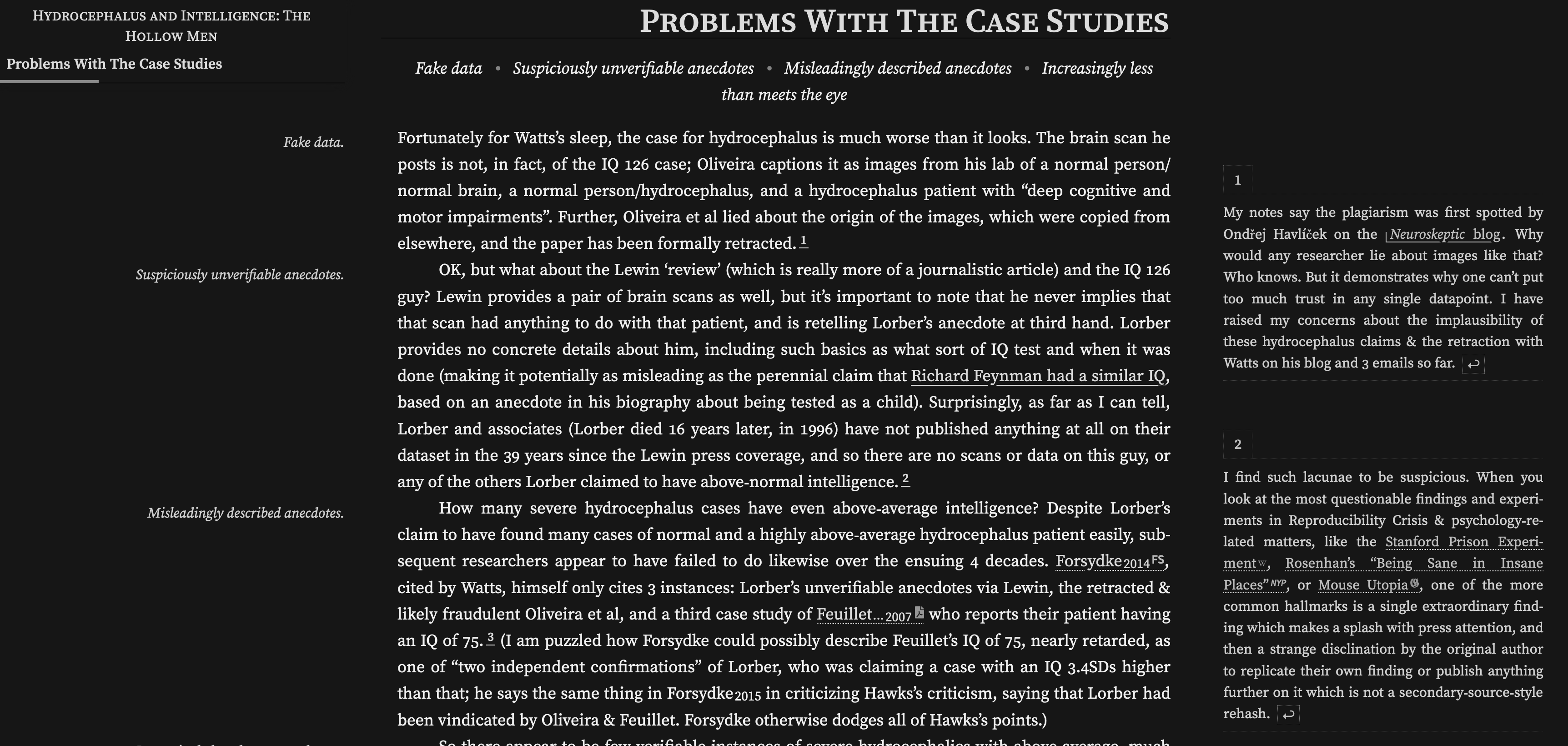
A screenshot of Gwern’s page on hydrocephalus
Sidenotes are nice because they allow for diversions without interrupting the main article’s flow. You can provide additional details for the curious reader, or — as Gwern does — use the sidenotes for citing studies or sources. In either case, the reading experience is significantly more pleasant that footnotes, for which you typically have to go to the bottom of the page, and then return to the top.
Another reason I called Gwern the “king of sidenotes” is this page on sidenotes. There, Gwern documents numerous approaches to this feature, mostly inspired by Tufte CSS. The page is very thorough — it even includes a link to my own work, as unknown as it may be! I would recommend checking it out if you are interested in enhancing your site with sidenotes.
Tables of Contents
Not all personal sites include tables of contents (TOCs), but they are nice. They serve two purposes:
- Seeing at a glance what the post will be about, in the form of headings.
- Being able to navigate to an interesting part of the page without having to scroll.
Static site generators (I myself use Hugo) are
typically able to generate TOCs automatically, since they are already generating
the HTML and know what headings they are inserting into the page. For instance,
Hugo has TableOfContents.
I suspect the same is true for other existing website technologies.
Despite this, I actually had to look relatively long to find sites I frequent that have TOCs to show off as examples here. The first one I came across — after Gwern’s, whose site will be mentioned plenty in this post anyway — is Faster than Lime. Take this post on Rust’s Futures; this is what the top of it looks like at the time of writing:
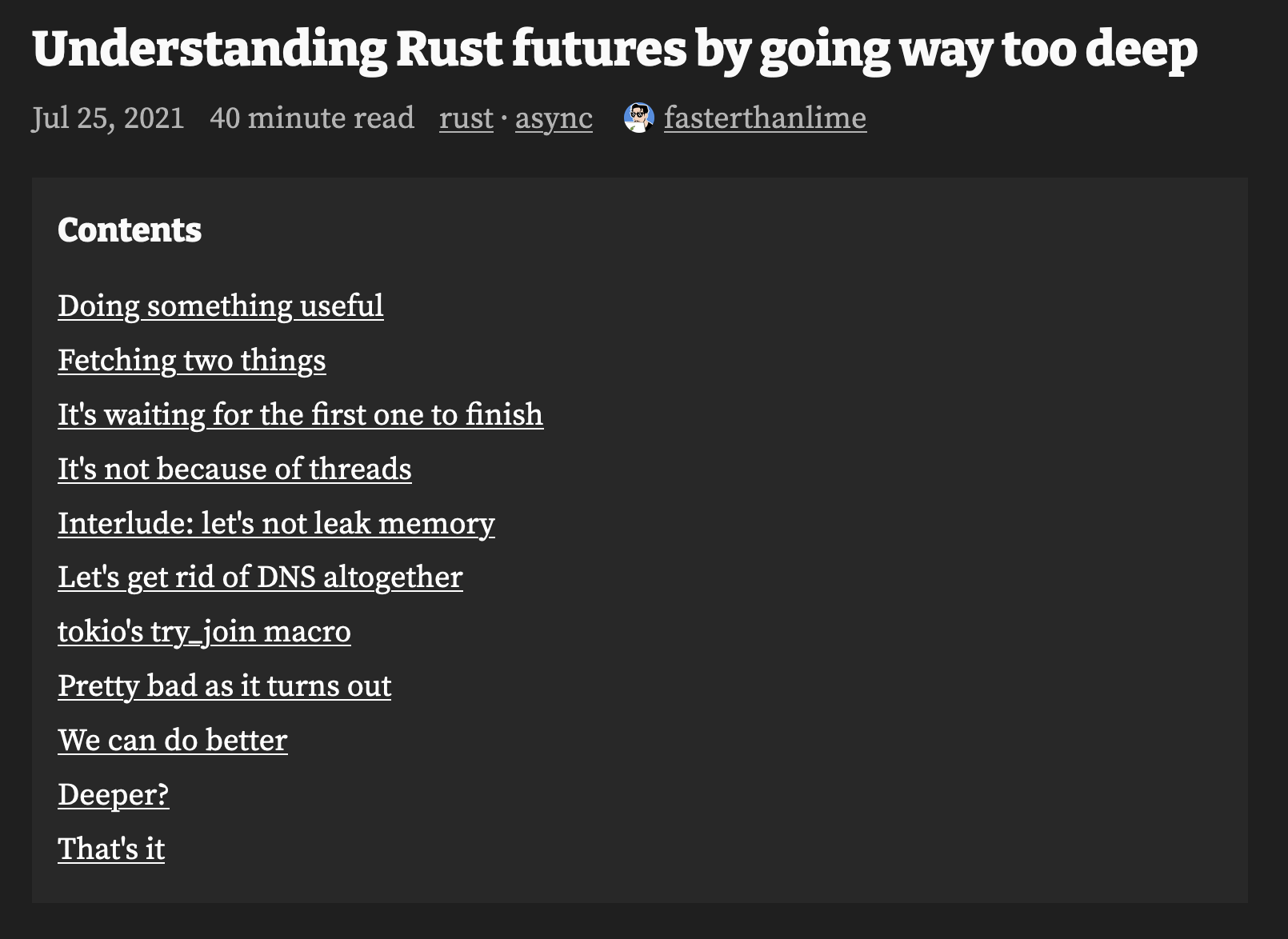
A screenshot of the table of contents on Faster than Lime
The quality and value of TOCs certainly depends on the sections within the page itself — and whether or not the page has sections at all! — but in my opinion, the benefits to navigation become apparent even for relatively simple pages.
As an honorable mention, I’d like to show Lars Hupel’s site. The pages on the site don’t — as far as I can tell — have internal tables of contents. However, pages that are part of a series — such as the introduction to CRDTs — have tables of contents that span the entire series.
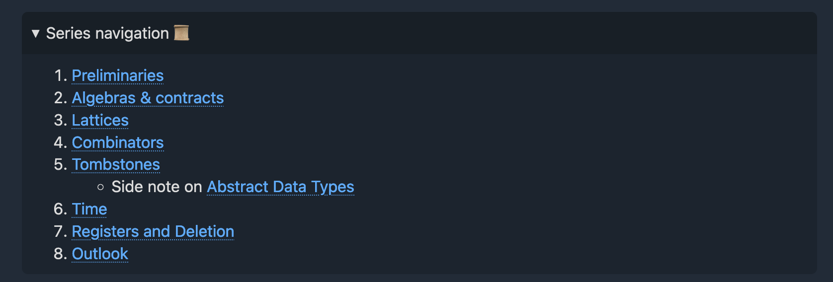
A screenshot of the table of contents on Lars Hupel’s site
I also find this very nice, though it does miss out on headings within a page.
Bonus: Showing Page Progress
I’ve mentioned that tables of contents can communicate the structure of the page. However, they do so from the outset, before you’ve started reading. In their “base form”, the reader stops benefiting from tables of contents [note: That is, of course, unless they jump back to the top of the post and find the table of contents again. ]
If you want to show progress while the reader is somewhere in the middle of a page, you could use a page progress bar. I’ve noticed one while reading Quanta Magazine; it looks like this (recording my scrolling through the most recent article at the time of writing).
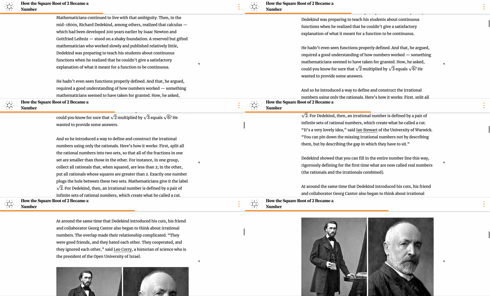
The progress bar on a Quanta Magazine article
One immediate thought is that this is completely superseded by the regular browser scroll bar that’s ever-present at the side of the page. However, the scroll bar could be deceiving. If your page has a comments section, the comments could make the page look dauntingly long. Similarly, references to other pages and general “footer material” count towards the scroll bar, but would not count towards the progress bar.
Combining the two, you could imagine an always-visible table of contents that highlights the current section you’re in. With such a feature, you can always see where you are (including a rough estimate of how far into the page you’ve scrolled), and at the same time see how the current section integrates into the broader structure. I’ve seen this done before, but could not find a site off the top of my head that implements the feature; as a fallback, here’s the CSS tricks tutorial that shows how to implement a dynamic table of contents, and a recording of me scrolling through it:
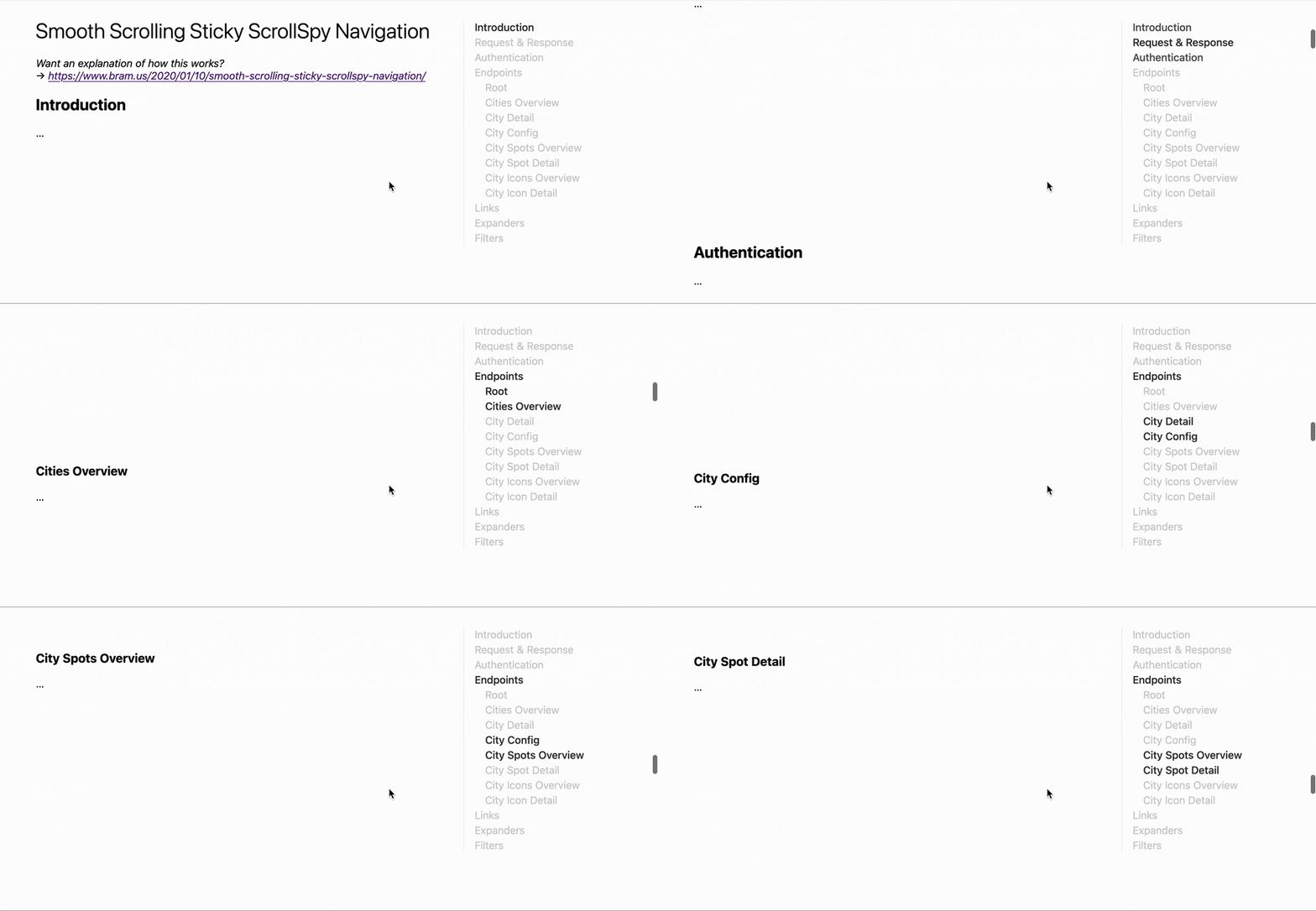
The table of contents from a CSS Tricks demo
Easily Linkable Headings
How can you link a particular section of a page to your friend? There’s a
well-defined mechanism to do this in HTML: you can use the ID of a particular
HTML element, and add it as #some-id to the end of a link to the page. The
link then takes the user to that particular HTML element. I can do this,
for instance, to link to the sidenotes section above.
How does one discover the ID of the part of the page that they want to link to? The ID is not a “visual” property; it’s not displayed to the user, and is rather a detail of HTML itself. Thus, on any given page, even if every element has a unique, linkable ID, I can’t make use of it without going into Inspect Element and trying to find the ID in the HTML tree.
The simple solution is to make the elements that you want to be easily “linkable” into links to themselves! Then, the user can right-click the element in question (probably the heading) and click Copy Link. Much easier! To demonstrate a similar idea, here is a link to this paragraph itself. You can now use the context menu to Copy Link, put it in your browser, and voilà — you’re right back here!
As with tables of contents, many website technologies provide most of the tooling to add support for this feature. Relatively often I come across pages that have unique IDs for each header, but no clickable links! I end up having to use inspect element to find the anchor points.
A variation on this idea — if you don’t want to make the entire heading or title a link — is to include alongside it (before or after) a clickable element that is a link to that title. You can click that element to retrieve link information, instead (and the icon additionally tells you that this is possible). Hugo’s documentation does this: here’s a screenshot of an arbitrary page.

A title and paragraph from the Hugo documentation
Grouping Series of Posts
Some authors like to write at length on a particular topic; to get the content out to readers faster (and to make the resulting pages less daunting), it makes sense to break a single topic up into a series. The easiest way to do this is to just… publish several articles, possibly with related names, and link them to each other. Done!
With a little more effort, though, the series-reading and series-writing experience could be nicer. Instead of manually inserting links, you could configure your website to automatically add a “next” and “previous” button to pages in a given series. You could also give an overview of a particular series and create a “navigation hub” for it.
As an example, the Chapel language blog has navigation buttons. Here’s a screenshot from a post in the Advent of Code series:

Series navigation buttons on a Chapel blog post
I’ve mentioned this in the section on tables of contents, but Lars Hupel’s site has tables of contents that link between series. I’m not sure if it’s automatically generated or hand-written, but it’s definitely nice.

A screenshot of the table of contents on Lars Hupel’s site
Dialogues
I first came across dialogues on Xe Iaso’s site, but I think I see them used most often in posts on Faster than Lime. As an example, here’s a little dialogue on a post about Rust’s futures. At the time of writing, it looks like this:
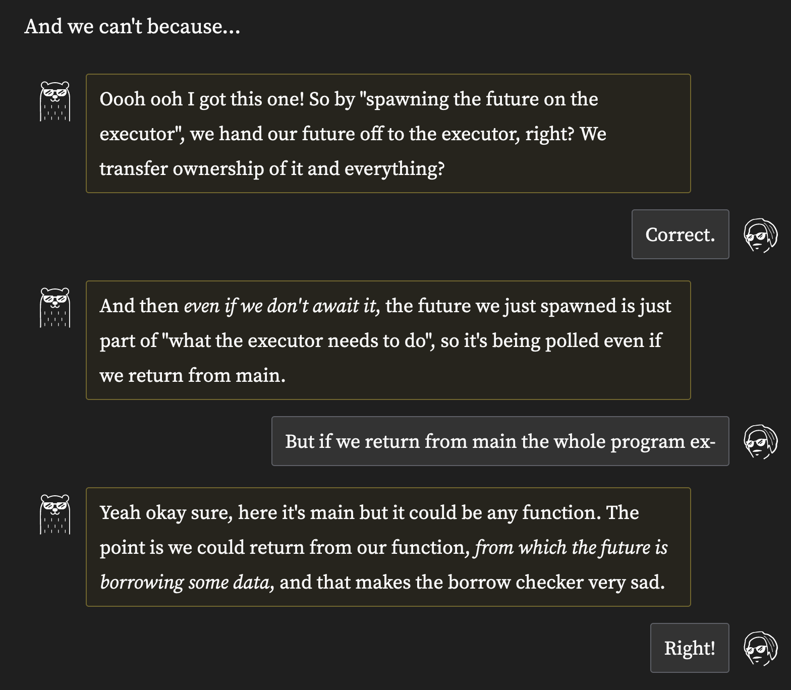
A dialogue with “cool bear” on Faster than Lime
Using dialogues — even for technical writing — is not a particularly novel idea. I know I’ve seen it in a textbook before; probably this part of Operating Systems: Three Easy Pieces. It can help ask questions from a less-experienced point of view, and therefore possibly voice concerns that a reader might themselves be having. And of course — as with “cool bear” and Xe Iaso’s many characters — it can change the tone and make the page a bit more fun.
Code Blocks with Origin
This one was recommended to me by a reader, and so I’ll be talking about my page specifically!
When I was writing about making a compiler, a reader emailed me and pointed out that they were getting lost in the various code blocks. My page displayed the code that I was writing about, but the project had grown beyond a single file. As a result, I’d be making changes midway through one file at one moment, and another file the next. This prompted me to add decorators to my code blocks that look something like this:
|
|
The decorator says what file the code is from, as well as what lines are being presented. If you click the file name, the decorator links to my Gitea instance, allowing you to read the code in context.
Though it’s not quite the same (in particular, it’s unfortunately missing
links), the Crafting Interpreters online book does something similar. It
describes changes to the code in words next to the changed code itself,
like “added after MyStruct”. Here’s a screenshot of the page on
local variables
at the time of writing.
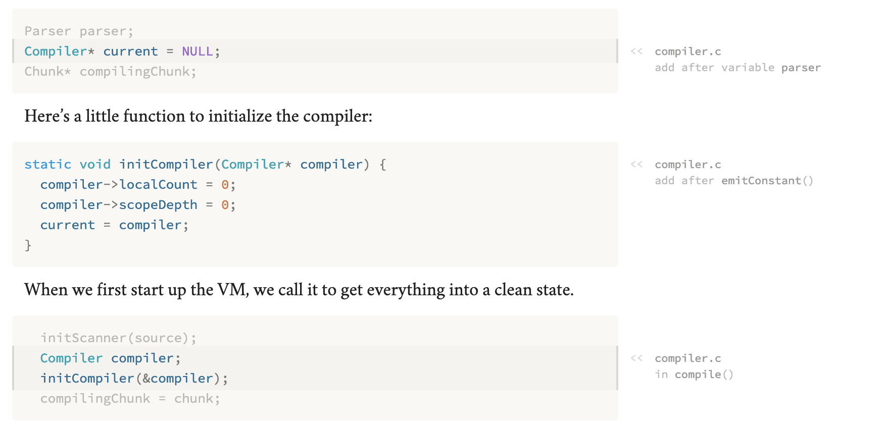
Location notes on code in Crafting Interpreters
I think it looks quite elegant, and in some ways — specifically in the verbal descriptions of what each change does — might be superior to my approach.
It’s not quite the same thing, but GitHub Gists can help approximate this feature. A Gist could contain multiple files, and each file can be individually embedded into your page. Hugo in particular has built-in support for Gists (and I’ve snagged that link using the docs’ easily linkable headings); I suspect that other website engines have some form of support as well. At the time of writing, an embedded Gist looks something like this:

Code embedded in Hugo documentation using a GitHub Gist
Clicking list.html takes you to the source code of the file.
Bonus: Code Blocks with Clickable Links
If we’re going for fancy code blocks, another fancy feature is provided
by the Agda programming language.
Agda can generate HTML code blocks in which every symbol (like a variable,
record name, function name) are linked to where they are defined. So if
you’re reading the code, and wonder “what the heck is x?”, you can just
click it to see how it’s defined.
It’s not simple to integrate Agda’s plain HTML output into an existing webpage, but some projects do that. I took a stab at it in my post about integrating it with Hugo. I wager this would be even harder for other languages. However, it leads to nice results; my go-to is Programming Languages Foundations in Agda. The online book introduces various concepts from Programming Language Theory, and each code block that it shows is fully linked. This makes it possible to jump around the page like so:

Navigating code blocks on a page from PLFA
Markers for External Links
Some sites I’ve seen mark links that go to a different domain with a little icon. If you’ve read this far, you’ve likely noticed that my site does the same. Another good example of this — even though the CSS is little rough at the time of writing — is James’ Coffee Blog ☕. I’ve taken the (small) liberty to adjust the color of the icon, which I suspect is buggy in my browser.

An external link on James’ blog
Some websites (this one included) also make such links open in a new tab
automatically. That way, you tend to not lose the original article by clicking
through one of its references.
Bonus: Different Markers for Different Destinations
Gwern’s website takes this idea further, by changing
the icon for external links depending on the destination. For instance,
links to Wikipedia articles are stylized with a little “W”, links to
Haskell.org are stylized using a lambda (), and links to
.zip files have a little archive icon. There are more; I’ve found
the link processing code on GitHub,
and even the list of websites that get their own icons.
I could not find a verbal description, though.
Edit: Gwern has pointed out that the links I provided go to obsolete code. The link processing functionality is documented in comments here and the link icon rules are here. A non-code list of icons exists too.
Now for some pictures. Here are a ton of links from the “About” page!
Links to Wikipedia on Gwern’s site A link to Haskell.org on Gwern’s site Links zip files on Gwern’s site


Bonus: Link Preview
Gwern’s website has no shortage of cool ideas. Among them showing link previews on hover. When hovering over a link, the site displays a popup window that contains a view into that page. I suspect that this view is also archived somehow, so that it retains a view into the page that matches it at the time of writing.
To be perfectly honest, I found this feature a little jarring at first. As I would try to click links, I would get surprised by an additional overlay. However, as I spent more time browsing the site, I grew quite accustomed to the previews. I would hover over a link to see the first paragraph and thus get a short synopsis. This worked really well in tandem with per-destination marker icons; I could tell at a glance whether a link was worth hovering over.
Here’s what it looks like:
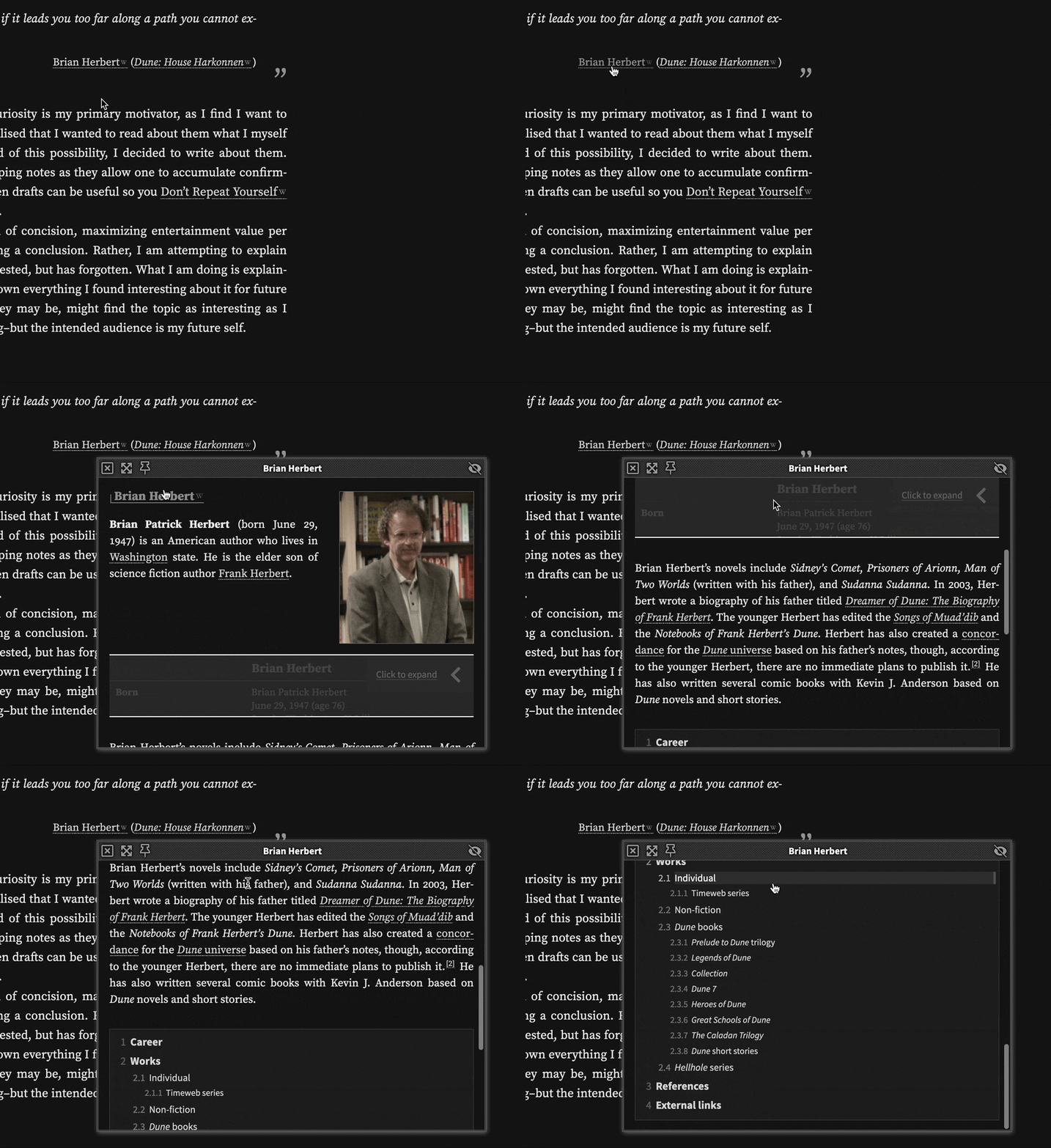
Hovering over a link on Gwern’s site
RSS Feeds
RSS is a feed standard that allows sites to publish updates. Blogs in
particular can make use of RSS to notify readers of updates.
RSS feeds are processed by a feed reader, which is a program that polls
a website’s index.xml file (or other similar files) and reads it to
detect new content. If you opt in to full-text RSS feeds, users can read
the entire post entirely from their reader.
RSS makes it easier to keep up with your site. Rather than having to check in on every author whose content I enjoy on the internet, I can add their feed URL to my list, and have my feed reader automatically aggregate all updates for me to read. It’s kind of like a social media or news feed, except that I control what’s shown to me, and authors of the blogs I follow don’t need to create accounts and explicitly share their work on social media!
I don’t have any particular website to show off in this section; instead I’ll show you a list of websites that I’m following in my feed reader of choice. You might notice that a lot of these websites are listed here as inspiration for other microfeatures.
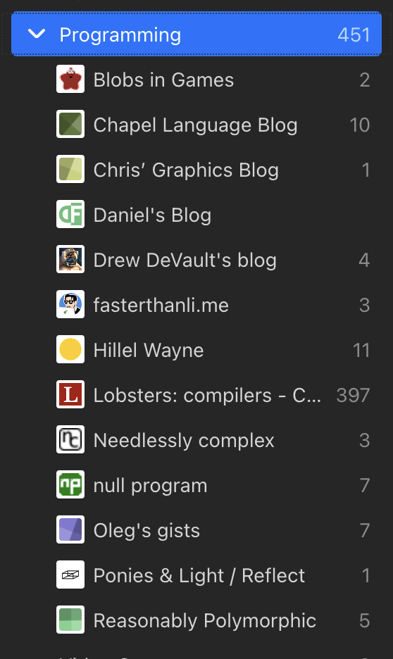
A screenshot of my Feedbin list
Links to Other Sites
This feature I first noticed on Drew DeVault’s blog. Every page on Drew’s blog, at the bottom, has a section titled “Articles from blogs I read”. For instance, on a sample post, at the time of writing, I’m seeing the following footer:

Links to other blogs from Drew DeVault’s blog
As indicated in the image, Drew’s site in particular uses a program
called openring, which is based on
RSS feeds (another microfeature I love). However,
how the site finds such articles (statically like openring, or
on page load using some JavaScript) isn’t hugely important to me. What’s
important is that you’re promoting other content creators whose work
you enjoy, which is the ethos of my favorite slice of the internet.
Conclusion + Anything Else?
Those are all the microfeatures that I could think of in a single sitting. I hope that you have been inspired to integrate features like these into your own site, or at the very least that you think doing so would be a good idea.
This list isn’t exhaustive. I’ve probably missed some good microfeatures! If you can think of such a feature, let me know; my email address is linked in the footer of this article.
Thank you for reading, and cheers!